A free-shipping bar on the cart page is useful — but by the time a shopper reaches the cart, they’ve mostly decided what they’re buying. The bigger opportunity is earlier: while they’re still browsing product, shop, and category pages. Showing your free-shipping goal there keeps it top of mind and encourages a larger basket from the start. This guide covers why a sitewide bar outperforms a cart-only one, the technical challenge it creates, and how to add one — with control over exactly where it appears.
Why a sitewide bar beats a cart-only bar
The cart is the end of the journey. The decisions that determine order size happen well before it — as shoppers add a first item, browse related products, and weigh whether to keep going. A bar that only appears in the cart arrives after most of those decisions are made. A sitewide bar plants the “spend $X, ship free” idea while there’s still shopping left to do, which is exactly when it can change behaviour.
Think of it as the difference between a reminder and a prompt. In the cart, “you’re $12 away” is a reminder of a decision nearly made. On a product page, the same message is a prompt that shapes the basket as it’s being built — it invites the shopper to add a complementary item now, rather than hoping they reconsider at checkout. That earlier placement is why sitewide bars tend to lift average order value more than cart-only ones.
The challenge: a sitewide bar needs the live cart total
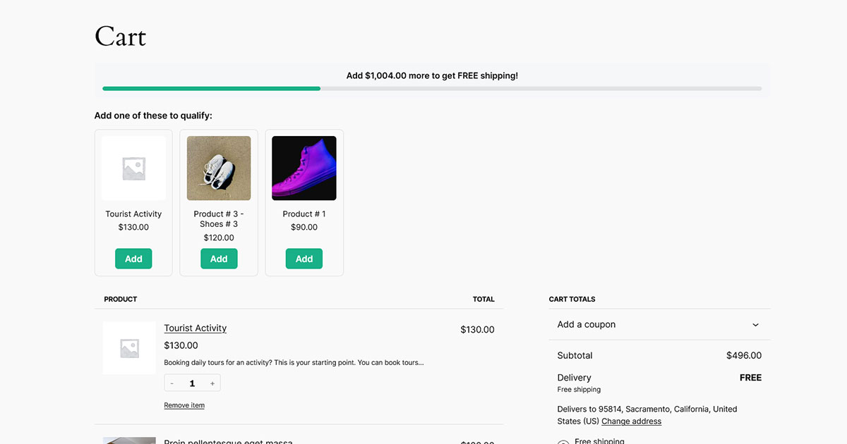
On the cart page, WooCommerce already knows the cart total. On a product or shop page it’s trickier: the bar has to know the current cart total and update when the shopper adds something — without a full page reload. A hard-coded banner (“Free shipping over $50!”) is easy, but a dynamic “you’re $12 away” bar has to read the cart as it changes and, ideally, only appear once there’s something in the cart worth nudging. On stores using the block cart and AJAX add-to-cart, that means reading the live cart data rather than relying on a value baked into the page at load time.
Option 1: A static banner (quick, but limited)
If you just want a fixed message, you can add a banner in the Site Editor or a hooked template part — for example a Group block pinned above your header that reads “Free shipping on orders over $50.” This works everywhere and needs no code, but it never changes: it can’t tell a shopper they’re $12 away, it won’t celebrate when they qualify, and it can’t suggest what to add. For some stores a static reminder is enough; for conversion, the dynamic version does far more because it responds to where the shopper actually is.
Option 2: A dynamic floating bar (recommended)
To show a live progress bar as shoppers browse, use a plugin that renders a floating bar and keeps it in sync with the cart. Free Shipping Bar & Upsells for WooCommerce does this and lets you control exactly where it appears:
- In Sproutient → Settings, set your threshold and enable the Floating bar.
- Choose the position — top or bottom of the screen.
- Leave Show everywhere on, or turn it off and pick page types: Home, Shop, Product pages, Category & tag archives.
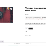
The floating bar appears once the cart has items and updates live as the shopper adds more — on whichever pages you selected. Because it works with both the classic and block cart, adding to cart from a product page updates the bar without a reload.
Where should you show it?
More isn’t always better — a bar on every page can feel pushy. Match placement to intent:
- Product pages — the highest-intent moment. Someone deciding on one item is the best audience for “add a little more and shipping’s free.”
- Shop & category pages — while browsing, so they build a bigger basket from the outset.
- Home page — optional; useful if a lot of your traffic lands there first, but easy to skip if it feels like clutter.
A good starting point is product and shop pages only. Watch how it performs, then expand if it’s helping.
Design tips for a sitewide bar
- Only show it with items in the cart. A “you’re $50 away” message on an empty cart is noise; it lands better once the shopper has started.
- Pick a position that avoids collisions. If you already run a sticky header or cookie bar, put the free-shipping bar on the opposite edge so they don’t stack.
- Keep the copy short. “Add $12 for free shipping” reads instantly; a paragraph doesn’t.
- Celebrate the win. A clear success message when they qualify reinforces the behaviour you want and feels rewarding.
- Mind mobile. A bottom bar is comfortable on phones, but test that it doesn’t cover key controls or the add-to-cart button.
Common mistakes to avoid
- Showing it everywhere by default. A bar on the checkout, account, and blog pages adds noise without intent. Scope it to shopping pages.
- A static banner pretending to be dynamic. If it can’t read the cart, it can’t say “you’re $12 away” — and a wrong number is worse than a general one.
- Ignoring overlap with other fixed elements. Two bars fighting for the bottom edge looks broken; plan the layout.
Frequently asked questions
Can I show the bar only on product pages?
Yes. With per-page-type controls you can turn the floating bar on for product pages and off everywhere else, or any combination of home, shop, product, and category archives.
Does the bar update when someone adds to cart from a product page?
With a plugin that reads the live cart, yes — it recalculates the remaining amount and repaints without a page reload, on both the classic and block cart.
Will a floating bar hurt mobile usability?
Not if it’s compact and positioned to avoid your other fixed elements. Test on a real phone and switch the top/bottom position if it overlaps anything.
Is a sitewide bar bad for performance?
Only if it’s built poorly. A good implementation ships minimal assets and reads the cart efficiently, so a lightweight bar on shopping pages has negligible impact.
The bottom line
A cart-only bar catches shoppers after the basket is built; a sitewide floating bar shapes the basket as it forms. A static banner is a fine reminder, but a dynamic bar that reads the live cart and appears exactly where you want it is what actually moves order size — and with per-page controls you get the reach without the clutter.